
As COP 25 moves into its second week in Madrid, there are two conflicting themes emerging form the conference so far. First the good news.
The good news is that it seems that 73 countries have already increased the targets they shared as part of the Paris Framework and another 11, including Spain, are in the process of doing so. Essentially all the countries in the world need to do more than the voluntary targets (Nationally Determined Contributions, to use the official name), that they have already committed to if the world want to avoid even more significant climate change.
The bad news is that neither the United States or China are on the list and the specialists at the conference are reportedly still arguing over the rules connected with Article 6, which as I discussed in last week’s post, is the framework for global carbon trading.
To give some context to the entire issue, this post will focus on the facts about the current situation in terms of concentrated carbon in the atmosphere. Perhaps the most worrying issue facing the world today is that distortion, mis-representation, and lies appear to be the new normal in politics. I therefore wanted to make sure I have my own facts straight with respect to the climate debate and decided to share them this week.
To start with, I am using the Global Carbon Project as the source for the data. The project is science based, has been running since 2001, is very transparent about the members of its scientific steering committee and it’s sponsors. For people who like data, I recommend digging into the infographics and other information on the web site as it gives detailed information on all of the sources and sinks of carbon based on the best data and estimates the organization can find.
For those without the time or inclination to get into it. I have picked these four charts that I think summarizes the situation.

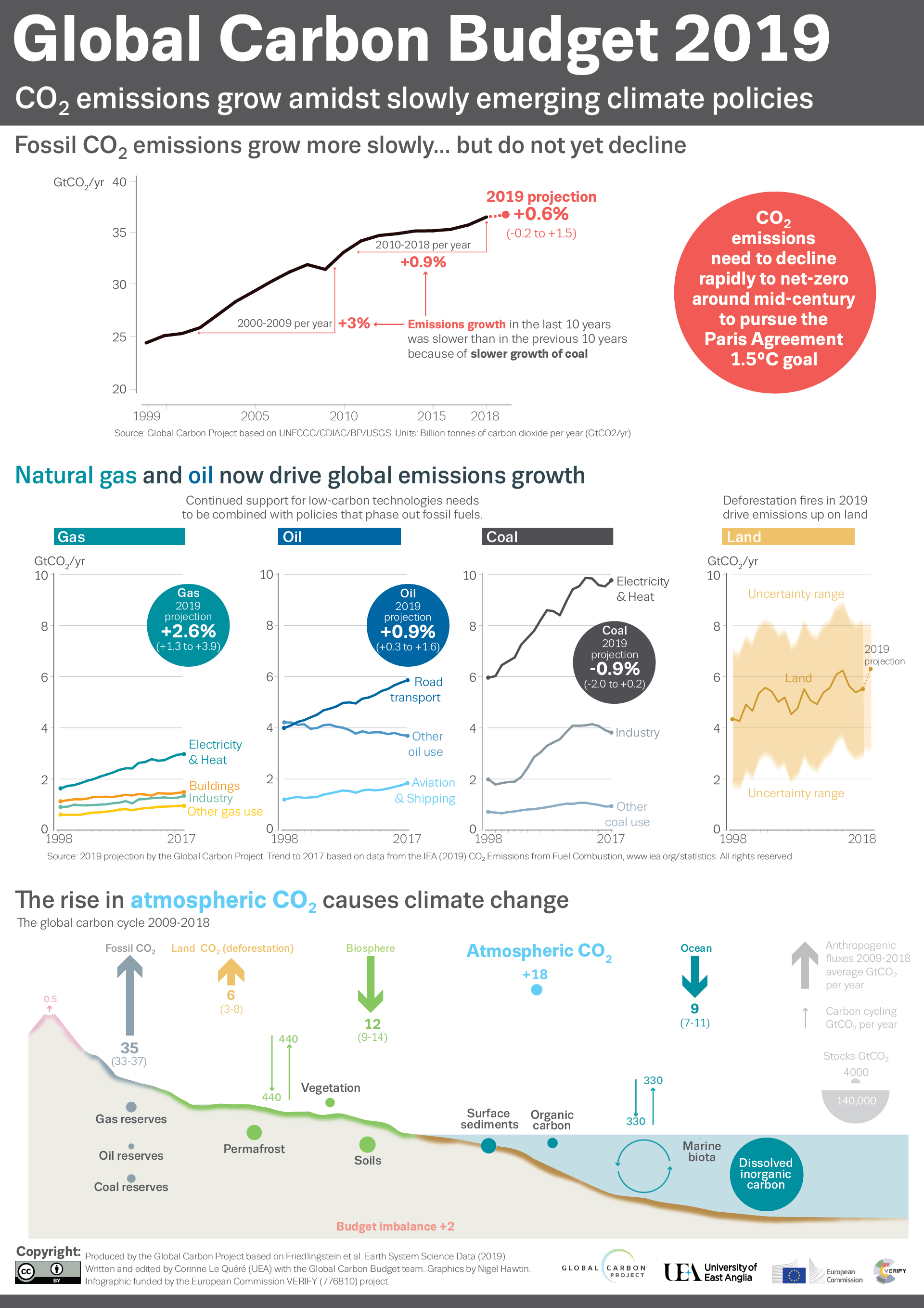
In my view, the starting point for any serious discussion about climate change is the fact that the world continues to put more and more carbon in the atmosphere and we have actually doubled the total amount in the last 30 years or so.
On the same graph you can also see that the problem lies in the rising emissions of China and India and the fact that, while slowly tapering off, the pace of change in the US and Europe is far to slow to offset the increase. Emissions are rising in many developing countries as their populations enjoy more and more of the benefits of modern life. One of the central ideas behind the Paris Accord is that the way to fix the problem can not be to deprive billions of people from prosperity.
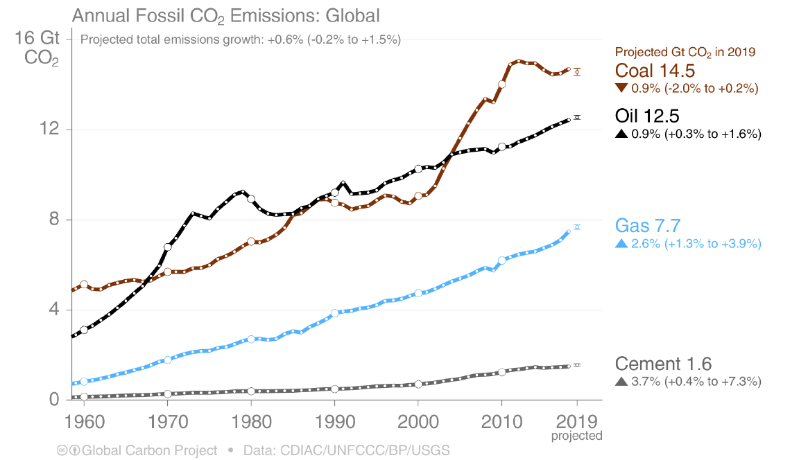
The second graph shows emissions by the source of the energy produced and coal is still the number one culprit. Emissions for gas has also risen as coal has been substituted with gas. This is a good thing in terms of the overall carbon balance since gas is much cleaner than coal but clearly the world needs to do much more to continue to develop renewables and other low carbon source of energy.
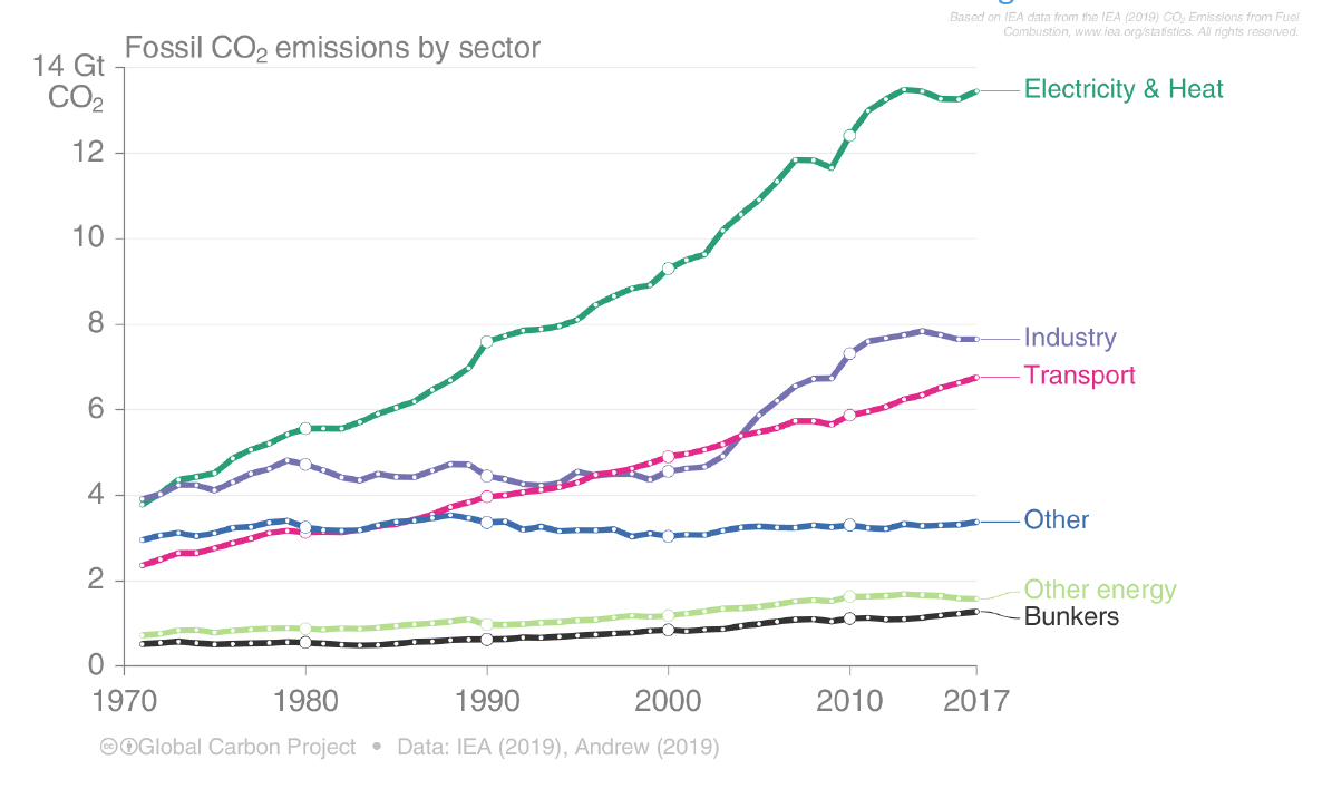
The third chart shows emissions by sector and the key thing to understand is that energy efficiency could potentially cut emissions by 25-50 percent across all categories. Much of this can be done with well proven and readily available technologies such as insulation, double plated glass, electric vehicles, etc. The thing is that we have largely built the world using technology from the 40s, 50s and 60s when energy was practically free and the climate was not yet an issue. By rebuilding our homes, buildings, factories, and transportation infrastructure with efficiency in mind we will be able to ensure that the world can enjoy a prosperous life with less energy.

The last chart shows projects based on the amount of carbon in the atmosphere and the impact on the average rise in temperature as opposed to pre-industrial times. The chart is about pathways or the sum total of different solutions which give different results over time. The important thing to take away from this chart is that to stay under 1.5 degrees of average warming, it will probably not be enough to become carbon neutral by 2050 as many countries, cities and organizations are pledging to do.
I say probably and maybe because, while the science of global warming is perfectly clear, we do not have a full understanding of the all of the myriad feedback loops that can affect the system.